

Caring for the Most Vulnerable
Embedding as a fractional design leader inside a virtual behavioral health startup, from foundational research through hands-on delivery to future-facing product vision.

The Context
Author Health was a tech-enabled virtual care company focused on seniors with serious mental illness. This population faced compounding challenges like aging, trauma, cognitive decline, and social isolation. They were early-stage and well-funded, but still operationally scrappy. They ran on spreadsheets, monday.com, and an off-the-shelf EHR that was not built for their model.
I joined as a fractional design director as they were just launching their first patient cohort and stayed for over a year, evolving my role as the company's needs evolved. I moved from strategic discovery, to hands-on product delivery, to future-facing vision work that shaped their platform roadmap and investment narrative.
Phase 1: Understanding the Patient Journey
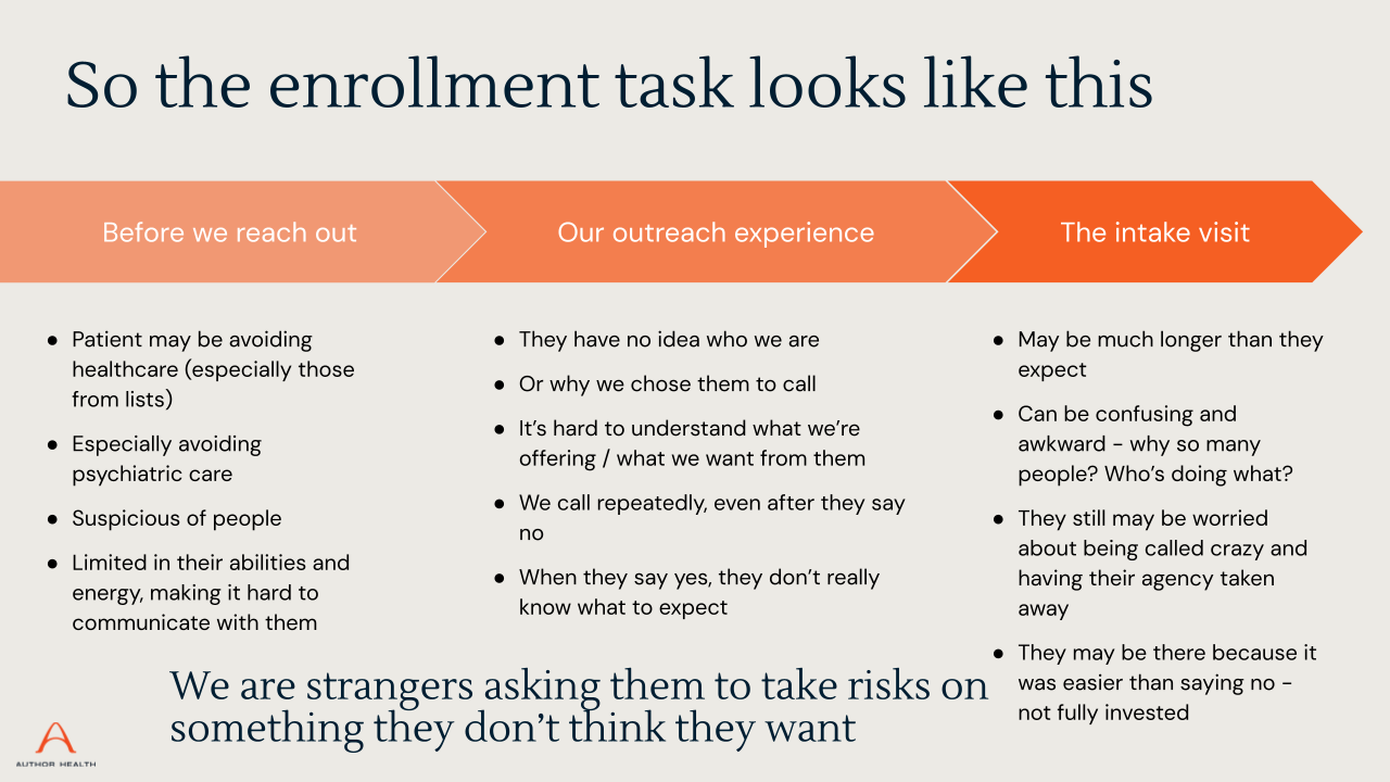
I started by not designing anything.
Author's team was deeply committed to their mission, but there was no shared, externally informed view of what the patient and caregiver experience actually looked like end to end. Before we could build with confidence, we needed to deeply understand the people we were building for and the ecosystem they lived in.
What I did
I brought in a research partner and together we ran a foundational research program to inform and refine the key business hypotheses.
In-home interviews with 13 patients and 5 caregivers across eastern Florida. Participants were aged 59 to 85 and were dealing with depression, schizophrenia, bipolar disorder, dementia, and PTSD
Journey mapping and ecosystem mapping exercises with each participant, tracing their path from life before Author, through their impetus for care, early interactions, and ongoing engagement
Stakeholder interviews across Author's clinical, operations, and product teams to understand internal pain points, team priorities, and where the organization was learning versus building at the same time
Literature review on designing for aging populations, trauma-informed design principles, and technology adoption barriers among seniors with serious mental illness
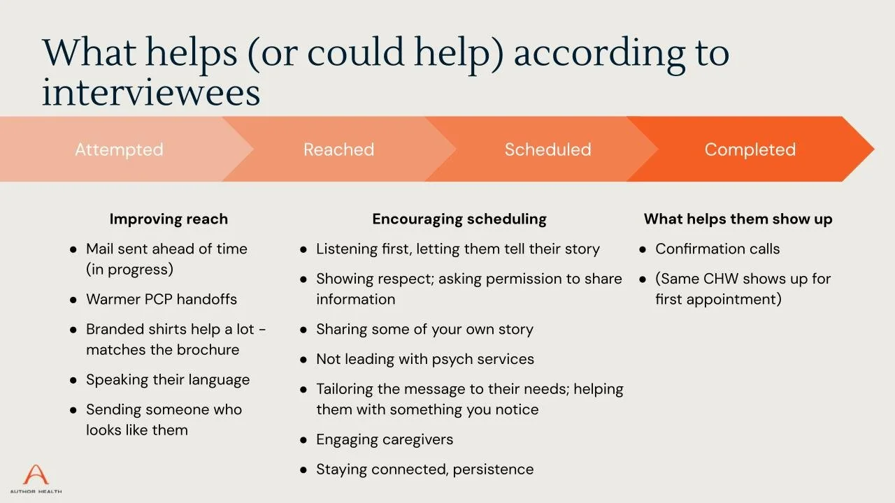
What we learned
The research surfaced insights that reframed how the team thought about their product:
Loss was the common thread, not diagnosis. Almost every participant had experienced devastating personal losses that triggered or worsened their mental health challenges. Design needed to be trauma-informed at every touchpoint.
PCP referrals passed the "trust baton." Author's credibility came from the primary care relationship. Without it, building trust from scratch was a fundamentally different challenge.
Caregivers were the hidden infrastructure. Many patients could not navigate technology, scheduling, or follow-through alone. Caregivers were managing everyone's healthcare (including their own), and they were dedicated but totally overwhelmed.
Technology wasn't the barrier. Confidence was. Most patients had smartphones. What they lacked was confidence troubleshooting, and the expectation that anyone would help them figure it out.
Author had no brand identity for patients. Participants didn't know what "Author Health" was. They knew their provider's name. The brand existed in the relationship, not the platform.
Example Theme - Customer Challenge
Example Theme - Customer Challenge
Example Theme - Service Principle
Example Theme - Service Principle
Phase of Journey with Pain Points
Phase of Journey with Opportunities
Phase 2: Hands-On Design Delivery
With a clearer picture of the patient journey and the team's operational reality, I shifted into direct product work. I built the experience layer on top of their headless EHR implementation.
This was not visioning. It was shipping.
What I Built
I led design across multiple parallel workstreams and collaborated closely with engineering:
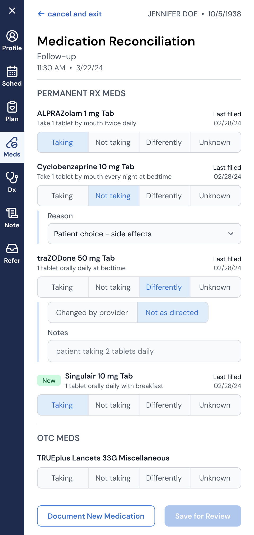
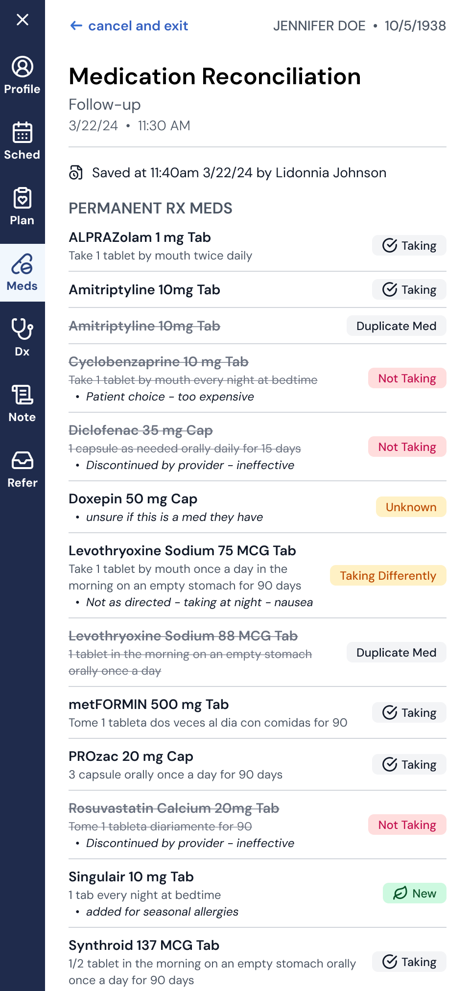
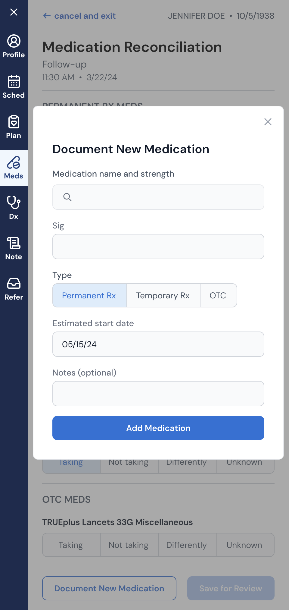
Medication Reconciliation: Redesigned the medication reconciliation workflow in an EHR overlay. This was a critical clinical flow where MAs and providers needed to document an accurate medication list at the start of each visit. The existing off-the-shelf experience was clunky and error-prone. I took it through discovery, workflow mapping, and iterative design. The result was a streamlined experience that gave providers confidence in treatment plans and laid the groundwork for future capabilities like shared med lists and adherence programs.
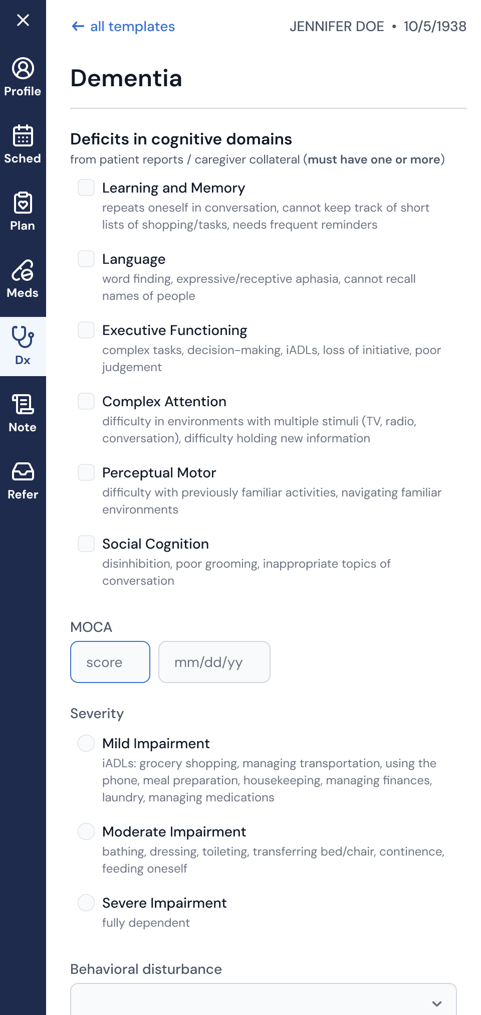
Accurate Diagnosis: Designed clinical decision support templates to help clinicians diagnose and document complex mental health disorders.
AI Scribe Integration: Designed how AI-generated visit summaries would flow into the clinician workflow, balancing documentation efficiency with the need for clinical review and trust.
Patient-Reported Outcome Measures (PROMs): Moved PROMs collection into the platform to enable clinical integration, traceability, and the ability to independently create and administer new instruments.
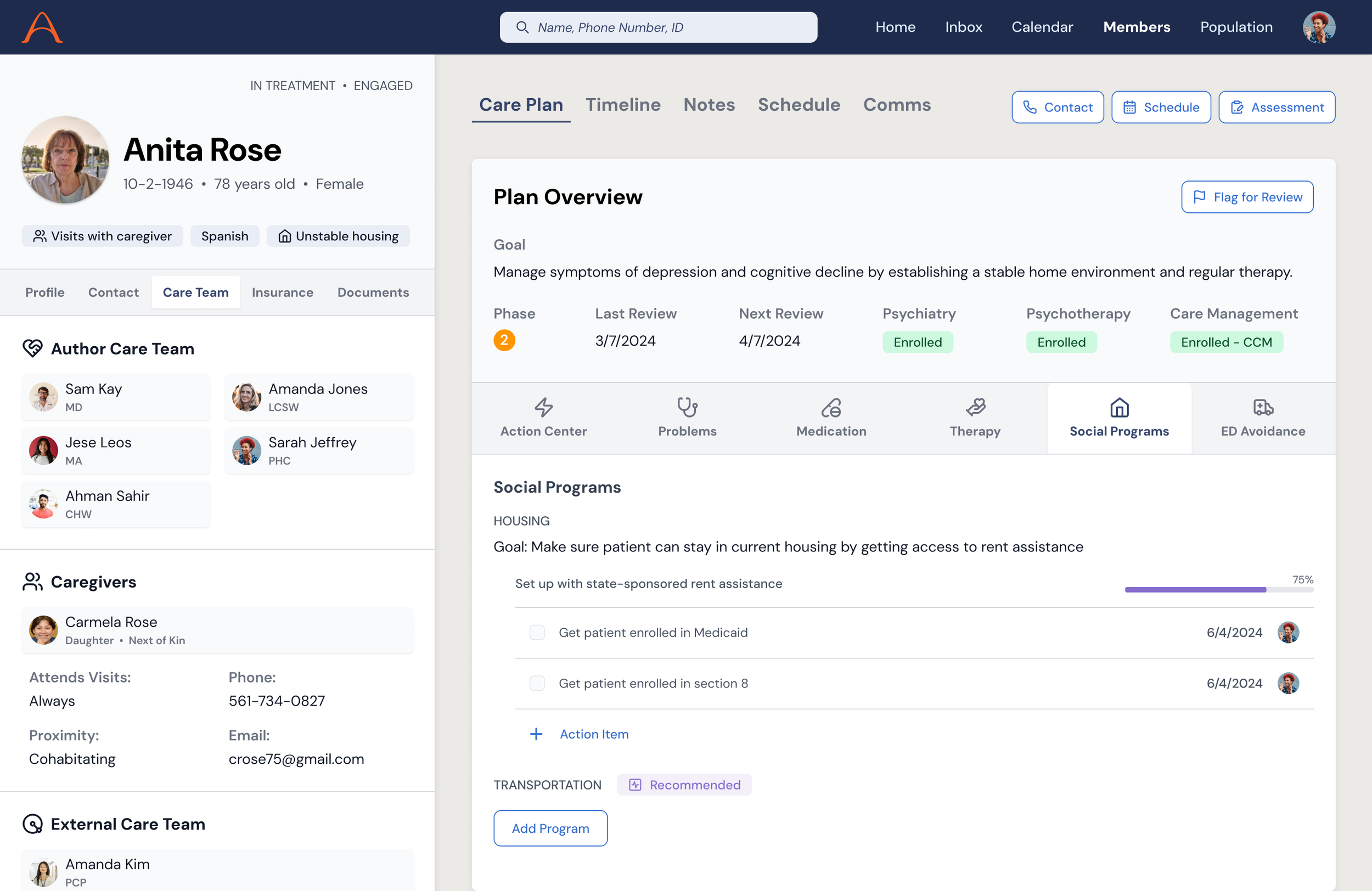
Patient and Caregiver Experiences: Designed the patient-facing web app (appointments, care team visibility, caregiver management, and appointment reminders) grounded in the accessibility and simplicity principles from our research.
How I worked
I wasn't a consultant handing off specs. I was embedded:
Running design critiques and pairing with engineers on implementation
Managing and mentoring two designers on adjacent projects, ultimately helping them transition to a full-time Author employees
Engaging a researcher and content writer as fractional contract partners
Building and maintaining the design system as a shared foundation
Participating in quarterly planning onsites to scope and prioritize the roadmap
Iterating weekly with clinical stakeholders who lived the workflows we were redesigning
Selected designs from EHR sidebar
Phase 3: Future-Facing Product Vision
As the hands-on delivery work matured and the first full-time designer was onboarded, I transitioned into the work I had been building toward: a forward-looking product vision that could inform the roadmap, align the team, and tell the story of where Author was headed.
This was the synthesis. I pulled together what we learned from research, building, and operating the service, then translated it into concept UIs that articulated the future of Author's platform.
These weren't just pretty screens. Each concept was tied back to a specific hypothesis from the research, a real operational pain point, and a measurable business outcome, including patient engagement, enrollment conversion, and care team efficiency.
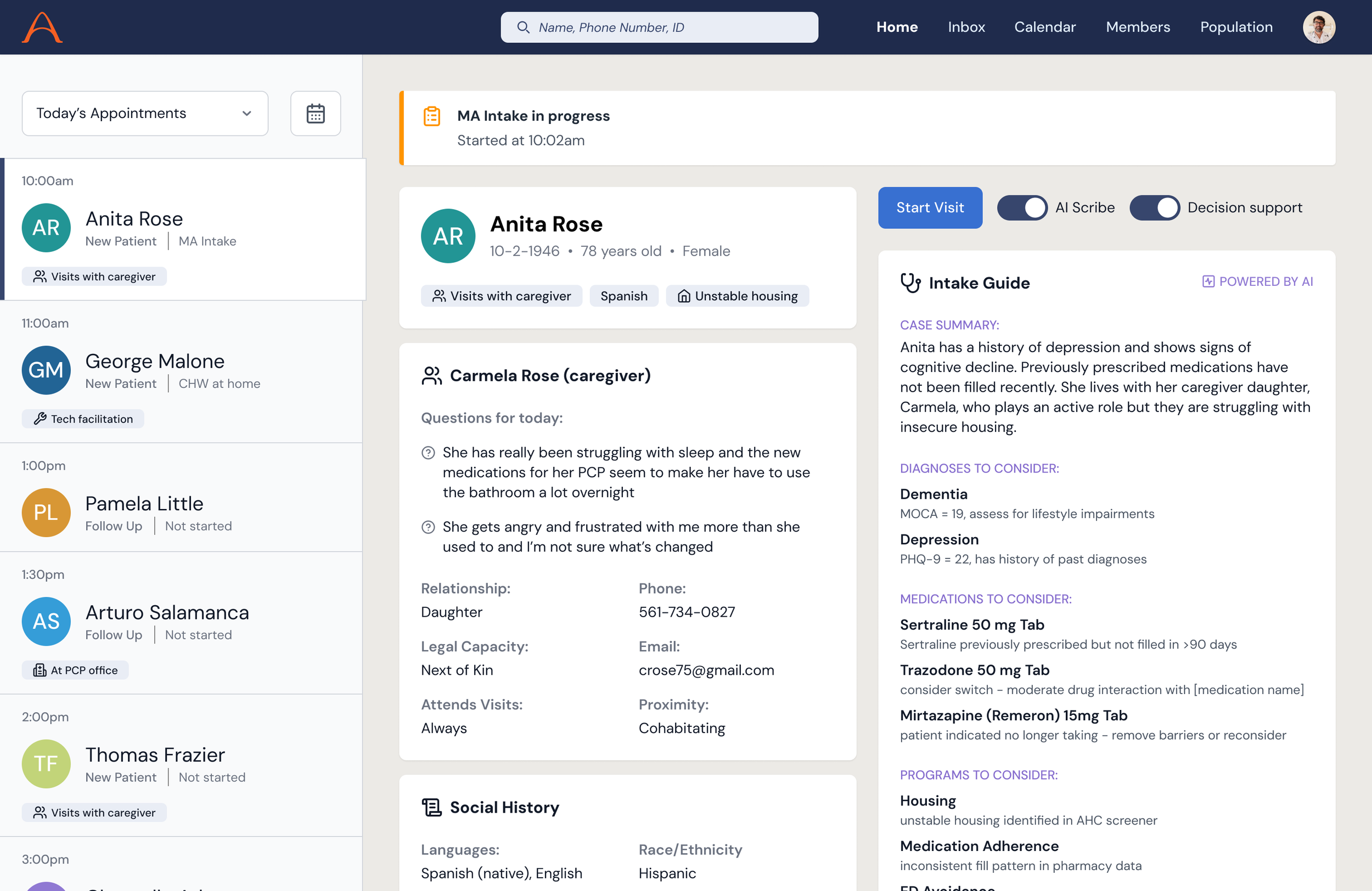
Smart Intake
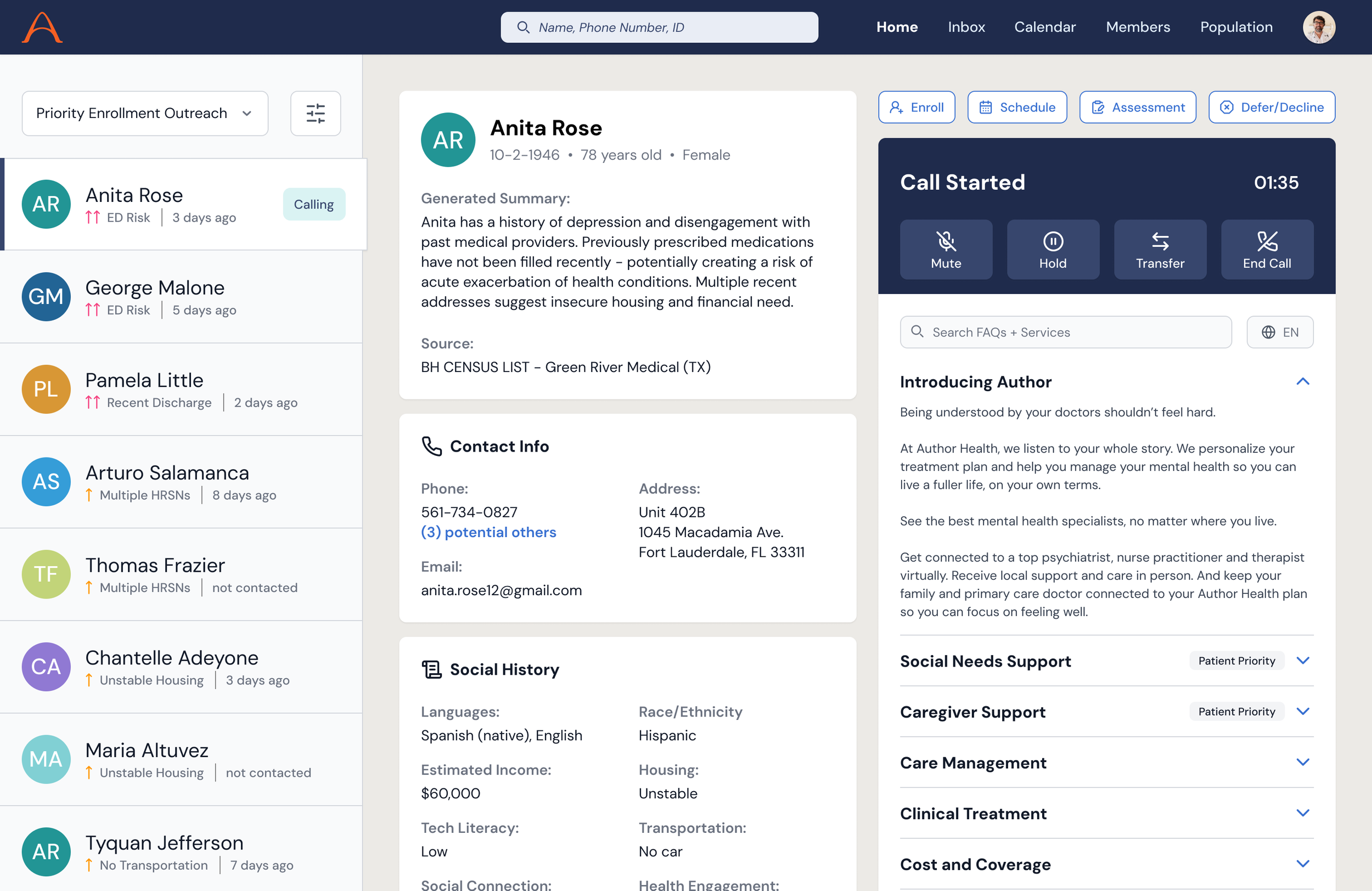
A reimagined visit prep experience that reduced the burden on clinicians and drove a more efficient patient interaction. A generated case summary is surfaced along with potential diagnoses, medications, and support programs to consider. This highly prioritized view let the clinician more easily connect with the patient and focus on what matters most.
Integrated Planning
A unified view for care teams to see the full picture of a patient's needs, goals, barriers, and care plan. This replaced the fragmented spreadsheets and monday.com boards that coordination relied on. The concept showed how clinical, social, and operational data could converge into a single planning surface.
Targeted Outreach
An intelligent outreach tool for enrollment coordinators and community health workers. It used AI-generated patient summaries and guided conversation frameworks to help non-clinical staff have more effective, empathetic first conversations with prospective members.
What Made This Work
The arc mattered. Starting with research gave the delivery work a spine. Being in the weeds during delivery, seeing what broke, and hearing clinician frustrations made the vision work credible instead of aspirational.
Embedded, not external. I was not a consultant who showed up for workshops and left. I was in the team Slack, in sprint reviews, and at onsites. That proximity let me move between strategic and tactical work without losing context.
Built the team, not just the product. I brought in and managed sub-designers, helped hire the first full-time designer, and established the design system and processes that would outlast my engagement.
Designed for the hardest users first. Seniors with serious mental illness, limited tech literacy, trauma histories, and cognitive decline. If you can design something that works for them, with empathy, simplicity, and reliability, you've built something that works.